Wedding Invitation Colour Palettes That Feel Rich
Wedding invitation colour palettes as design choices: nine combinations we love, why fewer colours look richer, paper tone and matching every event.
When families first write to us, they often know the colour before they know the design. "Something in emerald." "Not red, everyone does red." Colour is the first thing a guest feels when the card opens on their phone.
We have written before about what the traditional wedding colours are felt to say. This note is about something more practical: how to put two or three colours together so the card looks rich rather than loud, and how to choose a palette that suits your season, your venue and your family.
Fewer colours, richer card
The quickest way to make an invitation look expensive is to take colours away.
A card with seven bright colours has nothing leading, so nothing feels precious. A card with one deep colour, one light ground and one small accent does the opposite. The deep colour sets the mood, the ground gives the words room, and the accent (usually a metal) is where the eye lands last.
A simple way to think about it:
- One main colour that carries the feeling: emerald, plum, navy, dusky rose.
- One ground that is quiet: cream, ivory, blush, or a very deep tone for evening cards.
- One accent used sparingly: gold, silver or rose gold, in a border, a motif or the names.
Anything beyond that should be a small detail, like a single red rose or a string of white jasmine.
Nine palettes we keep coming back to
Each of these is a mood rather than a rule.
Jade and gold
Cool, calm and a little unexpected. Jade lets gold glow without looking brassy, and it suits a day wedding near water or greenery. Kamal builds a jade lotus pond where two swans glide toward a leaf boat of marigolds and a lit diya.
Plum and rose
Plum is what we suggest when a family wants depth without red. A soft rose beside it keeps it warm.
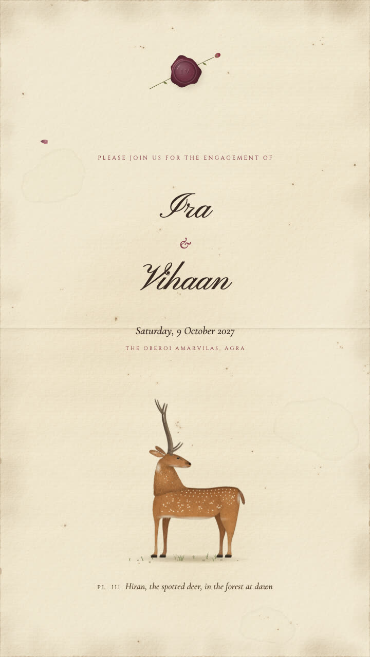 Seen hereHiranEngagement invitation
Hiran shows the pairing at its most restrained: a spotted chital stag looking back over his shoulder on an aged ivory plate, painted hair by hair in the Company School manner, beneath a plum wax seal with a pressed rosebud. The plum and rose live only in the seal, and the whole card takes its tone from them. It has two cards for the engagement.
Emerald and ivory
Emerald is the jewel colour families ask for most when they want something regal but fresh.
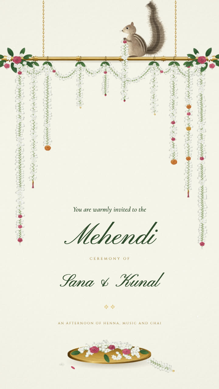 Seen hereMograMehendi invitation · Punjabi
In Mogra, an emerald curtain opens on a little palm squirrel on a carved brass rod, hauling up one more jasmine gajra to hang beside the rest. It is a mehendi card in two parts: invitation and details. For emerald with gold instead, Baggi is deep emerald and gold.
Navy and silver
Navy and silver belong to the evening.
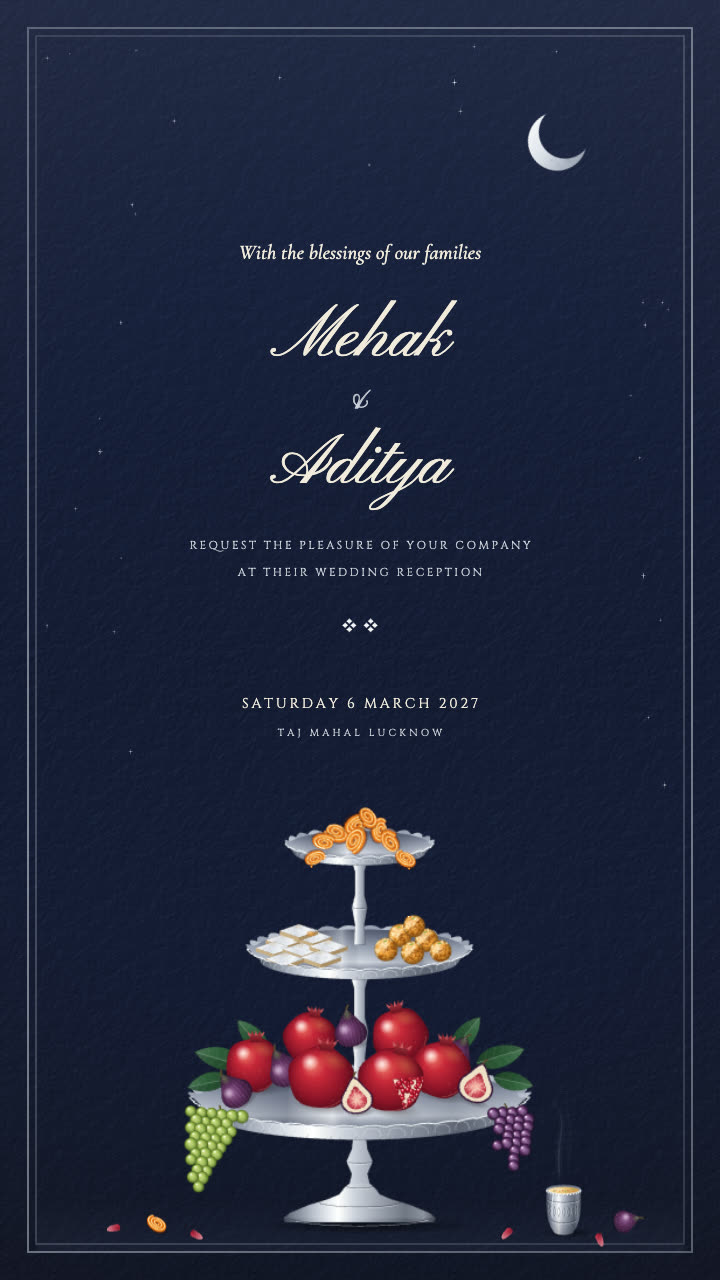 Seen hereVarqReception invitation
Varq is midnight and silver: a tall silver stand of pomegranates, figs, grapes, kaju katli and jalebis, the syrup slowly dripping onto the mithai below, the silver varq catching tiny glints and a kulhad of kesar doodh sending up a curl of steam. It has three cards. Chandi takes the same idea into silver foil on deep navy.
Blush and rose gold, or blush and gold
Blush is soft enough to feel personal and warm enough not to feel pale. It is lovely for engagements and receptions.
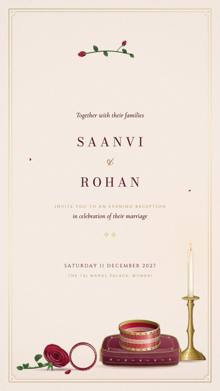 Seen hereChoodiReception invitation
Choodi is blush and gold: a stack of ruby glass and gold bangles on a velvet cushion catches the candlelight, and one bangle rolls slowly across the table to rest against a single red rose. The ruby and red stay accents, never a second main colour. It has three cards. For rose gold on blush, see Kamal Taal.
Red-oxide and cream
Earthy, warm and grounded. Red-oxide is a softer, browner red than bridal red, and cream keeps it light. Deepam sets a rice-flour kolam on a red-oxide floor, with a Kanjivaram-red veil lifting on a lit brass lamp.
Pink sandstone
Not candy pink: the dusty, sun-warmed pink of old stone. It pairs well with marigold orange and brass. Rajwada and Gulabi Shehar are both built on pink Jaipur stone and shutters.
Dusky rose and ivory
The gentlest palette here, and one of the most grown up. It works for sangeets that feel more like a mehfil than a dance floor.
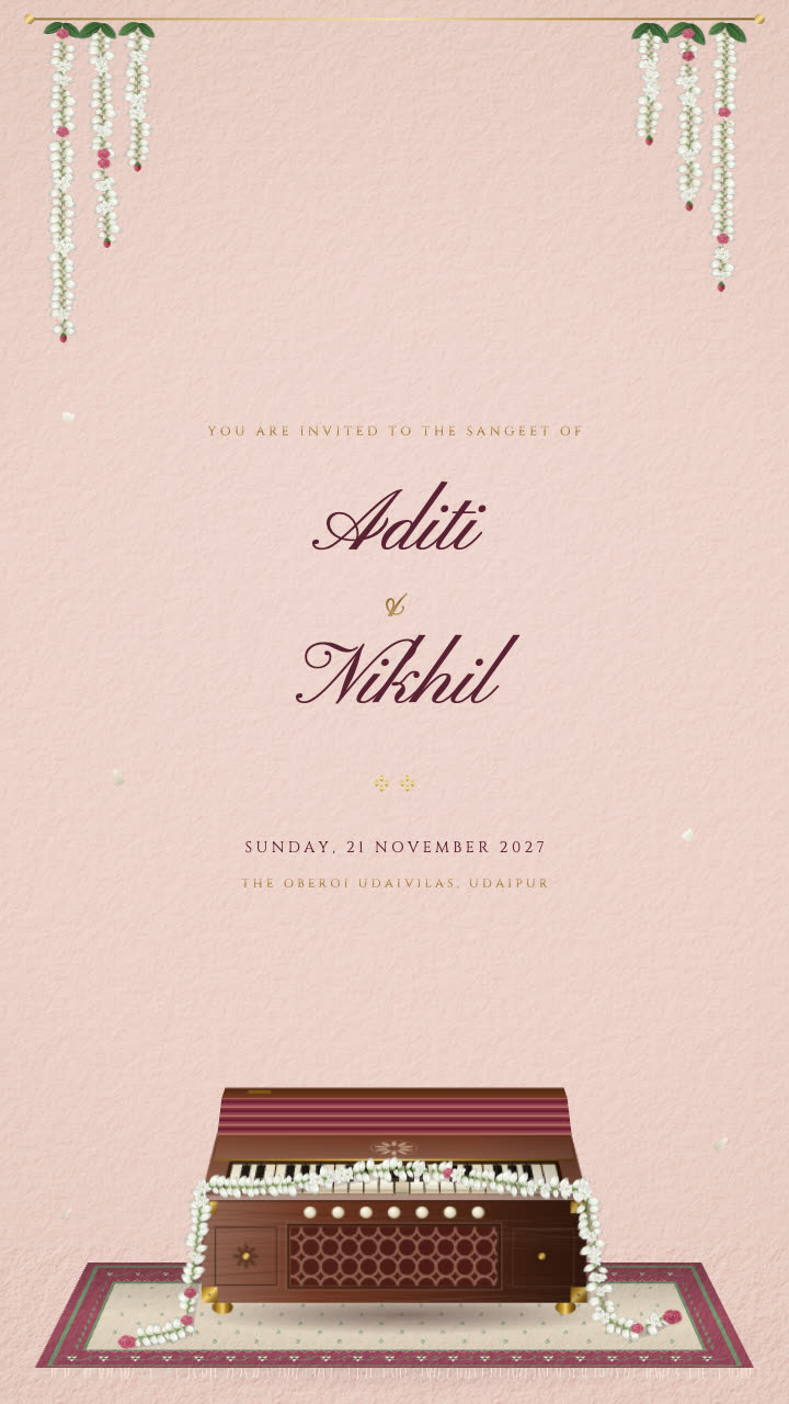 Seen hereSargamSangeet invitation
Sargam is dusky rose and ivory: a harmonium plays as if by an unseen hand, its bellows breathing and keys gently dipping while a string of mogra slips across them and jasmine petals drift down. It opens with a leaf reveal and has three cards.
Monsoon greys
Some families want something cooler and quieter, the soft greys of a rainy afternoon with one warm colour breaking through. It needs one strong accent or it can look flat. Kolkata is set on a monsoon afternoon at the Maidan, and a palette like this is also a good starting point for a custom design.
Paper tone changes everything
The same gold looks completely different on cream, ivory and white, and families often overlook it.
Cream is warm and slightly yellow. It makes gold look richer and red look deeper, and it gives the whole card a festive warmth.
Ivory is paler and a little cooler. It suits jade, emerald, plum and dusky rose, because it does not compete with them.
Pure white is one we rarely reach for. On a bright phone screen it can glare, and it makes most metals look thin.
Deep grounds like navy or midnight flip the rules. The ground becomes the main colour, and the light elements (silver, white flowers, the names) carry the card.
As a rule of thumb, warm colours want cream and cool or dusky colours want ivory.
How to choose your palette
- When is it? Winter weddings can carry deep jewel tones. Summer and morning events feel better in lighter grounds and softer colours.
- Day or night? A morning ceremony suits cream and warm colours. An evening reception suits navy, midnight or plum.
- Where is it? Let the venue suggest the colour. Pink stone for a Jaipur haveli, jade for a lake, red-oxide for a traditional home. Chinar, with chinar leaves drifting past a carved walnut window and snow mountains over the Dal, takes its whole mood from its place.
- What is everyone wearing? If the bride's outfit is already decided, borrow from it. A card that echoes the lehenga or sari feels personal without saying so.
- What does the family love? Some homes are emerald homes and some are rose. The eldest person's taste is often the right one.
Keeping the words readable on a phone
A beautiful palette fails if guests cannot read the date. Most guests see it on a phone, often in sunlight.
- Keep strong contrast between text and ground. Deep text on cream or ivory, or light text on navy. Mid tones on mid tones disappear.
- Do not set the details in metal. Gold names can look lovely, but gold dates and addresses are hard to read. Keep the practical lines in a solid colour.
- Leave a calm area for the words. The busiest colour should sit around the text, not under it.
- Check it small. Look at the proof at the size it appears in a WhatsApp chat. If the date is clear there, it is clear everywhere.
Every card is sized 1080 by 1920 for WhatsApp and Instagram, and we set the type with this in mind from the start.
Matching a palette across events
When a wedding has four or five events, the cards look best when they feel like one family rather than strangers.
The easiest approach is to keep one thing constant and let the rest move. Keep the ground (ivory throughout, say) and change the main colour by event: soft yellow for the haldi, emerald for the mehendi, dusky rose for the sangeet, navy for the reception. Or keep the accent constant, with gold on every card, and let the grounds shift from cream in the day to deep tones at night.
Avoid the exact same palette on every card, or guests may think they received the same message twice.
Ordering your invitation
Choose a design whose colours you love, and write to us on WhatsApp with your names, dates, venues and any palette notes. You will see a proof within 48 hours, and two rounds of changes are included.
A still invitation is ₹5,000. The same design animated and delivered as a video is ₹10,000. If your palette needs an entirely new design, we can draw one from your idea for ₹15,000, with a proof and two rounds of changes included. Every card is illustrated in our studio, and we accept only a limited number of commissions each month.
 Next storyWinter Wedding Invitations: Ideas for the November to February Season
Explore the collection of luxury wedding invitations, or write to us on WhatsApp.